Greetings, dear traveler
Tavern Tale and its team are very appreciative and thankful that you took the time to click and read this piece, we hope you enjoy it.
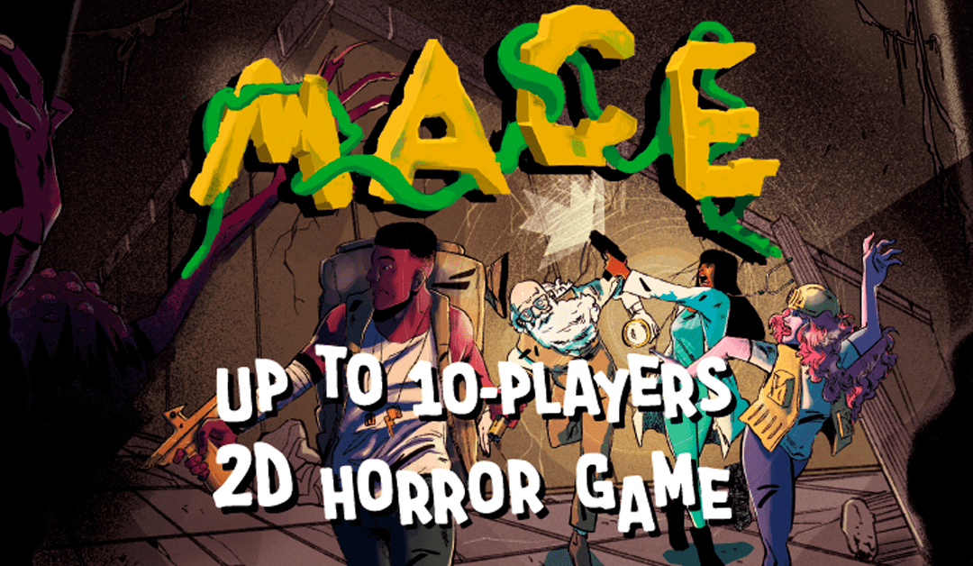
In this write-up, we intend to retell the making of, design choices and main difficulties faced while developing MACE: Mapinguari’s Temple, our most recently released game.
It is very interesting to write a “post mortem” about a game that is only a few weeks out by now, especially when said game still has a long way to go in its post-launch life. But alas, every trail blazed thus far has led us to 29th April, the official launch of our first steam game. More amazingly yet, is the fact that, like many indie games, it began its development life as an innocuous and unambitious game prototype, that seemed like nothing more at the time.
Let’s dial back and start from the beginning. The creation of MACE’s prototype came during the extremely confusing and chaotic first year of the pandemic, 2020. During this year, a few important games viralized because of their multiplayer and all-appealing thematics: Among Us and Phasmophobia. These games were very easy to hop-in and play a few rounds with your friends at any given time, they were easy to learn, very interactive and most important of all, really fun games. The frenzy around these games also impacted us, and it was a daily occurrence throughout 2020 to be asked to join said games sessions.
Unfortunately for our accessibility consultant Kessia, who is legally blind and has only 5% of her sight, these games were very hard to play and have fun with. Among Us, because of its colorful characters and big outlines could be played to some extent, while suboptimally, meanwhile Phasmophobia was, accessibility wise, completely unplayable. And as such, Eduardo, our gallant programmer set himself on a quest to prototype a fairly simple version of Phasmophobia, using 3D Sounds and a lightning system, with the social deduction aspects of Among Us. That was the inception of MACE, at the time nicknamed Kaboreb (for no apparent reason) but aptly named “Betrayal at the Forest Den” during development(also for no reason).
The prototype had, at first, a learning purpose as well. Using the Mirror Networking framework for Unity, it was one of our intentions to understand how a multiplayer game could be made. We chose Mirror because we had some experience with Unity’s UNet before while we were at university. Since both frameworks had many similarities, we could grasp it fairly easily. Once the basics of player movement, a flashlight mechanic and a very simple monster AI were done, it was time for testing the prototype and iterating on it. We gathered a group of friends (big thanks to all of them!) and did some tests. Most of them were just to check if the networking features were okay at first but, as soon as new features were added, they would even ask for play sessions of the game.
At the time, the art was fairly simple prototype art, but already had some personality to it. It was made focusing on usability and accessibility, allowing us to check if the gameplay itself wasn’t exclusionary for someone with the same amount of sight as Késsia. We noticed that, although the game mechanics wouldn’t leave her out of the gameplay (she actually could play the game at that point and have lots of fun), we noticed that her experience could be heavily improved by adding customization features that were local to each player. We took notes regarding these tests, but the accessibility features resulting from those notes would not be further developed until we picked up the prototype again.
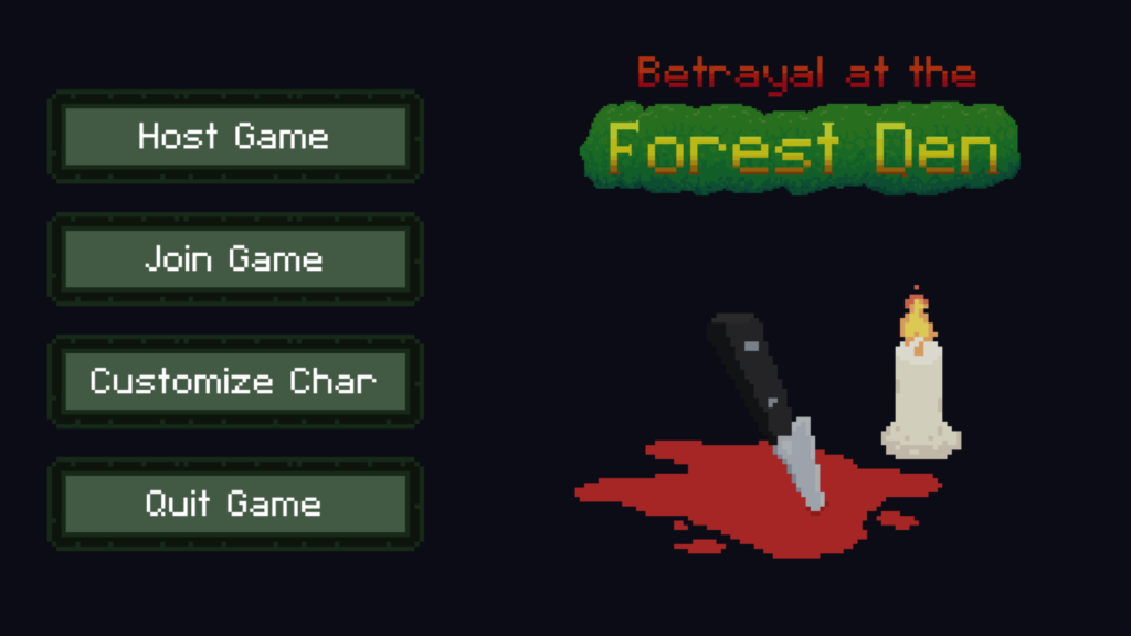
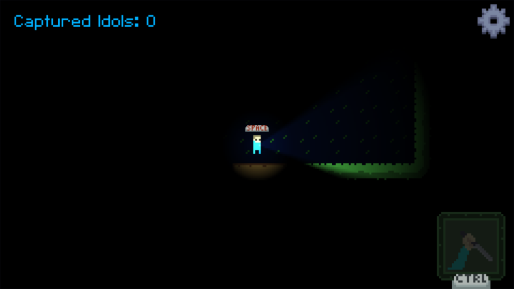
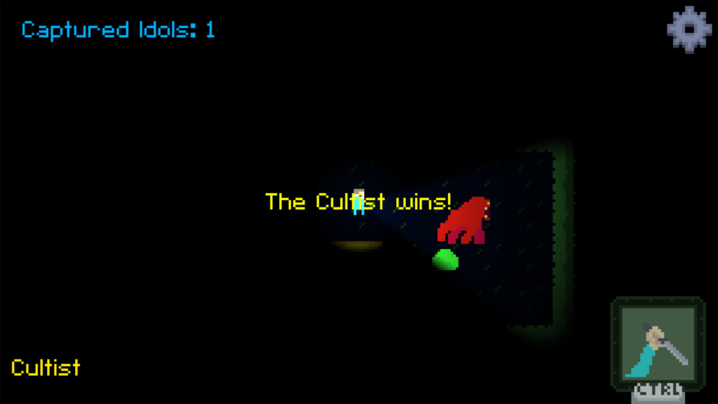
Once ready, we playtested it thoroughly, and it became clear that, despite its simplicity, the game had huge potential. Both friends and family that playtested it, had a blast.
Fast Forward a bit in time, to June 1st 2021, Tavern Tale was releasing its first ever game, Speedrun Squid (for mobile devices), while on the backside, we were also partaking on a government funding program: Start BSB with another yet unannounced project (that is in active development to this day!).
We felt like we were in a limbo, since while waiting for answers regarding the funding program we couldn’t work on the project we applied with. Besides that, Speedrun Squid was very easy to maintain after launch, so we had time to spare each week. And since we could stay in this limbo state for an undetermined amount of time while waiting for the program results, we decided to invest on another shorter project that could be done in a few months. That’s when the development of MACE truly began.
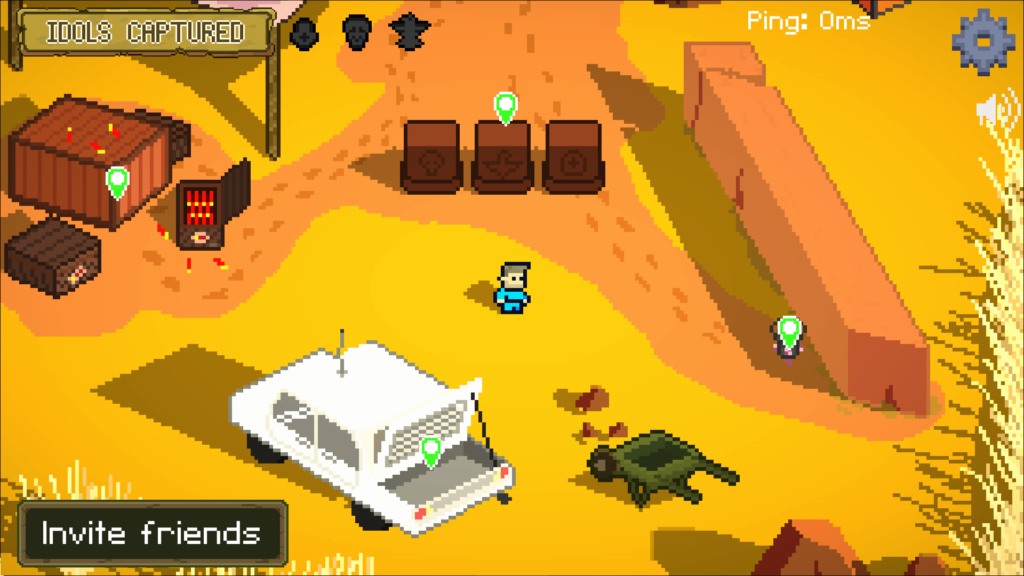
We knew, when revitalizing this project, that our goal was to maintain its simplicity, both mechanically and visually, only adding elements that would improve upon those stepping stones the prototype layed out for us. We also knew we wanted to add more and more accessibility features, and regardless of the alterations we did to the game’s visuals, it was important to keep a very high contrast and legibility.
We made plans to alter the following:
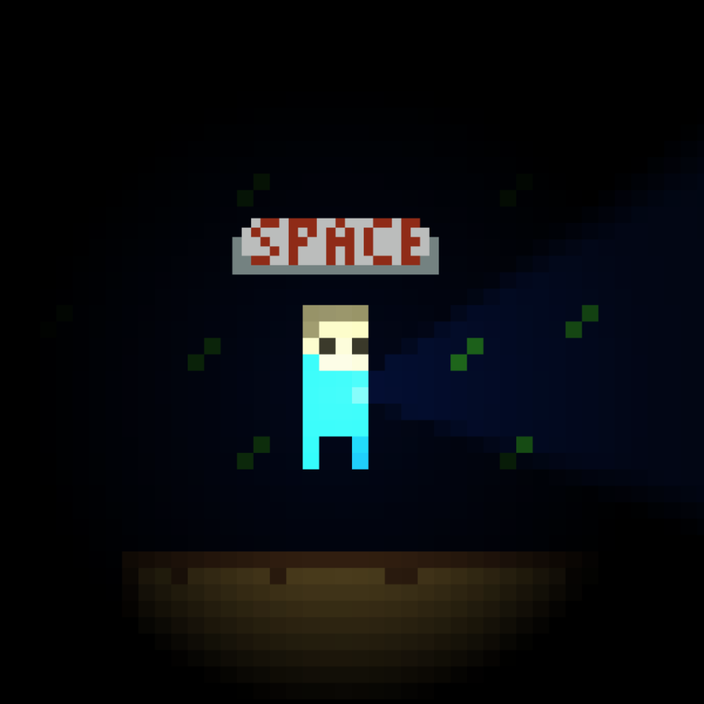
Design and animation of the player character:
We tried to remain true to our first version of the design, but with a bit more space for customization. With a bit more detail to the face, body and features, our Average Joe character was born. He was the base for all other skins in the game moving forward.
Tileset and scenario:
When approaching the development of MACE, we knew the scenario was one of the weakest points of the demo. While functional, the art was limited on the amount of depth and detail it offered the game. Moreover, the idea of a hunt for lost idols in the middle of a forest was forcing the suspension of disbelief of this Indiana Jones-esque horror setting. That’s when, through some short iterations, we decided upon the abandoned temple/ruins scenario.

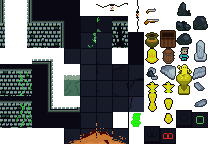
The idea of a dangerous ancient ruin, from an ancestral civilization, that is somehow terribly cursed, is very common in popular culture (movies, games and such alike) and could be easily built upon to instant recognition by the public. And since this game had no intentions of harboring deep lore at first, we stuck to the idea. Lost indigenous haunted temple it is.
Monster concept:
Designing the creature for MACE was another interesting challenge. Our team had never dabbled in creating “horror”, and much less so with pixelated graphics. So we sat down and considered our options.
To achieve fear, we had to extract bits and pieces from various different areas and fields, such as other games, cinema and literature.
We understood that the prototype wasn’t scary per se, it was unsettling at best, so through testing, we identified a few key possible culprits:
- Player speed: The players moved too fast through the map, both making accidental “bumps” into the monster more common, as well as creating this weird “race” metagame where just blasting off in one direction full throttle was the best possible strategy. This created an “action” type of gameplay, which was not intended. Meanwhile horror could be categorized as a more “reactive” type of gameplay, where the player reacts to the mechanics stimuli, as well as anticipation and buildup being key factors for that creeping in of FEAR into the player.
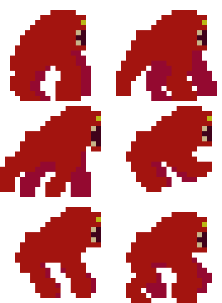
- Creature design: The creature itself wasn’t scary. Its overall shape was round and friendly, something a few white pixel “teeth” weren’t enough to compensate for. It had a warm color as a very defined shape to boot, making it very easy to read at a glance, which automatically makes it less scary to a majority of players. Unless we found someone who truly fears quadruped creatures made out of pixels, only our sound design could make that sprite scary.
- Mechanics: The initial creature, seen below as the red quadruped thing, had a very simple set of rules: it could pop out of nowhere and chase players making its gorilla-bear-snake sounds we had as placeholders and it would despawn after a while. After a few rounds of play, most players could understand how it worked and not even the burst of the sound amalgamation would do the trick of scaring them
- Artstyle: While there are plenty of pixel-art horror games that are very effective, the overall feeling we got (initially) while studying the mechanics of horror was that this art style was an uphill battle to generate horror, designwise. Pixel art is meant to be either nostalgic or a stylized representation of something, a visual reduction of an already conceived thing in our world, so to create something both recognizable and scary at a very small pixel density was a very hard concept to grasp.
- Accessibility: With the notes from prototype testing, we noticed that, should we change the visuals to anything other than the bright and colorful ones we were using, usability was going to be lost regarding people with low vision. And, with the perspective of change in many visual aspects of the game, something needed to be done so that the game keeps accessible. Not only that, but we also wanted to add features to support other different-abled people as well as quality of life features to make the game even more enjoyable to anyone that felt it was a good feature for them.
With those identified, we went to work on solving them. Below are the before and after results on said issues we identified while developing:
- Player speed solution: We limited the player speed to an (almost) halt, when comparing to the prototype, and to give the player more agency and a sense of control over the game, we added a stamina system to run. The constant need to manage a finite resource to move faster would (theoretically) improve the sense of claustrophobia, imminent doom and fragility of the player character.
- Creature design solution: We redesigned the creature to be more amorphous and less defined, a purple blob with mismatched eyes, two long slender and unproportionate arms and a hulking mass of a body with a gaping giant mouth in the middle. The fact it’s shape, features and it’s now very dark desaturated colors are so ambiguous and undefined made for a pretty unsettling creature that would hopefully: Be harder to comprehend at a glance, be able to trigger that “fear of the unknown” sensation, while boasting a few easy to read features: Long sharp limbs, gaping sharp giant mouth, that will both, definitely and quickly KILL YOU (which will result in fear or discomfort).
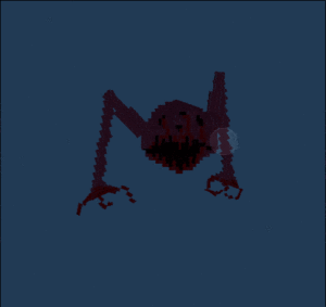
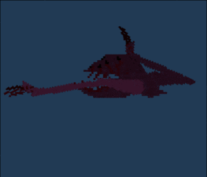
Also, the monster was inspired by the local brazilian indigenous folklore of the Mapinguari, an ape-like creature with a single eye and a mouth on its belly that would eat only the head of its victims.
- Mechanics solution: The solution to the mechanics boiled down to the Monster’s AI and sound design. Regarding the AI and behavior, we decided to make the monster a bit more complex, making it respond differently to certain stimuli like light and sound, as well adjusting its chase behavior to give players a chance to hide. To fix the frustrating sensation that the monster spawned right on top of the players, we also made a set of rules for the monster to spawn, which added a lot more complexity when designing spaces and rooms, but ultimately paid off. Also, to make each encounter that more intense, we also invested heavily on sound design. Trying to make it more unnatural, the creatures growls and grumbles are all distorted human voices. Not only that, we also added a heartbeat sound that starts to play when the monster is somewhat near, so the players could identify when the monster was approaching (even before they see it). The result was an formidable adversary to those trying to explore the halls of MACE, the creature is relentless, bizarre, and I made sure not to spoil all the little surprise behaviors we added to the creature, so go ahead and take a few scares to find out ! <3
- Artstyle solution: Regarding Artstyle, as mentioned when talking about creature design, it was all about ambience and recognition. When we changed the game’s tileset, we did so to evoke a darker, more monotone and somber atmosphere. The new creature design did the same, so it left us only to solve the need for greater customization of characters and “worldbuilding”. So we created an overall narrative, even if not explicit, and made the initial area, trap rooms and new characters with that narrative in mind. We kept their overall shape and readability, and aside from the customization of color, most characters could be easily separated from the background. So all in all the problems regarding artstyle were resolved.
- Accessibility:Using the notes we gathered from earlier prototype testing (and also during future steps of testing and development) we noticed that, indeed, the new visuals needed to have a higher contrast, especially regarding the monster. Our solution was an optional customization feature that greatly increased the contrast of the monster when compared to the dungeon. We also noticed that it was fairly common for Késsia to bump into a wall while running from the monster, since her reaction time from identifying a solid object with the flashlight to actually avoiding it was greater due to the legal blindness. To solve that, another optional feature allows the player to see the room walls in high contrast (independent of lights) while the monster is in a hunting state. Other features were added while we identified possible problems that would exclude people, such as a control remapper, high contrast on traps, alternative font for the UI, the list goes on (and we are also open for new suggestions so we can make the game even more accessible)!
Closing thoughts:
It is safe to say that making and releasing MACE: Mapinguari’s Temple has been nothing short of amazing. We loved to work on it, loved that we kept it short and sweet, avoiding the pitfall that is Scope Creep. Amazingly, we managed to overcome its development challenges along the way, while working only part-time and dealing with a government program on the background.
To say we learned a lot with MACE would be an understatement. From the process of marketing it organically to the challenges of getting the game on Steam, to sharing the anxiety driven feeling of pressing the figurative “release button”, to the thrill of seeing people, friends and streamers randomly pickup and enjoy the game. All of these experiences are priceless and regardless of the overall success of the game, being made with a 0-marketing budget and all, we couldn’t be happier right now.
We have another, bigger project in the oven, one that we intend to reveal when the time is right, and we are using everything we learned and more to make it the BEST of our games yet. On that note, the future is looking ever brighter for the Tavern Tale team.
Participate in a growing community where you can learn more about Tavern Tale, our games and game dev in general.
